Reetu | Nov 27, 2023 |

ICAI Logo Guide: Know All About Using New ICAI Logo
The Institute of Chartered Accountants of India (ICAI) held a press conference on Thursday in Ahmedabad to share information about the first Global Professional Accountants Convention (GloPAC) on the theme “Connecting the Globe, Creating Value” at the Mahatma Mandir Convention Centre in Gandhinagar, Gujarat, India.
The Institute launched the New “CA” Logo during this occasion. The new logo is a one-of-a-kind emblem that embodies Indian ideals while also reflecting the ICAI’s objectives of quality, independence, and integrity. It also emphasises the accounting profession’s consistent dedication to being a partner in nation-building.

Incorporation of Tricolor:
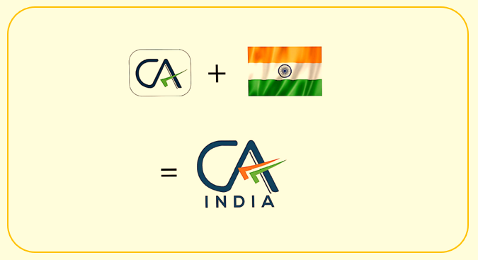
The incorporation of the tricolour into the logo is a powerful symbol of the Institute’s connection to India. The three colours of the Indian flag represent unity, diversity, and sovereignty, and they reflect the brand’s commitment to serving the people of India and contributing to the nation’s development. The tricolour has been used in such a fashion that it hints at motion, a flight, and a journey toward progress, showcasing the Institute’s forwardthinking approach.
Significance of blue colour:
The primary colour of the new logo is blue, which has been culled from the ICAI logo. Blue is a colour that is associated with divinity, immortality, bravery, and determination. It reflects vastness, being the colour of the sky and ocean, and has been an integral part of the Indian cultural, political, and social landscape over the years. Blue is also culturally significant, as it has been a part of the Indian tradition for more than 5,000 years.
Adaptability on all platforms:
The new logo can be adapted for use on all platforms, digital and analog, which is essential for a modern brand. This versatility ensures that the Institute’s brand is consistent across all channels, helping to strengthen its identity and credibility. The adaptability of the new logo also makes it more accessible to the Institute’s stakeholders, including members, students, and the general public.
In a nutshell:
The new logo of CA India reflects the brand’s connection to India while retaining its existing identity. The incorporation of the tricolor, the significance of the blue colour, and adaptability on all platforms are all essential elements of the new logo. The design is intended to be aesthetically pleasing and culturally significant, making it a strong representation of the Institute’s values and commitment to serving the people of India.
The logo consists of the letters ‘CA’ in blue colour with a tri colour tick mark (upside down) with white background. The blue colour not only stands out on any background but also denotes creativity, innovativeness, knowledge, integrity, trust, truth, stability, and depth. The upside-down tick mark, typically used by Chartered Accountants, has been included to symbolise the wisdom and value of the professional.
‘India’ is also added in the logo, as it epitomizes the Institute’s connection to India First approach and commitment to the serve the Indian economy in public interest.
There should be no alteration of the font ( colour, bold/unbold, size). Moreover, there should be no change in spacing and dimensions.
The colour palette is-

Do not change the design and colours including the white background.
Refrain from rotating or tilting the logo clockwise and anti-clockwise.
The logo should not be shrunk or distorted changing the original proportion.
While members are encouraged to use the new CA India Logo as published on letterheads, visiting cards, website etc, a transition time of one year has been provided to use existing stationary/signage replacement etc.
In case of any Doubt regarding Membership you can mail us at [email protected]
Join Studycafe's WhatsApp Group or Telegram Channel for Latest Updates on Government Job, Sarkari Naukri, Private Jobs, Income Tax, GST, Companies Act, Judgements and CA, CS, ICWA, and MUCH MORE!"